This project was created by Holly Cui, Parker Dingman, Sophie Dalldorf, and Kate Neal under the instruction of Professor Mine Cetinkaya-Rundel for the Fall 2021 section of STA 313: Advanced Data Visualization at Duke University.
Or refer to the link at https://tinyurl.com/colorblindapp. Source code can be found on our GitHub repository.
Introduction
Our project embarked on the goal of increasing awareness and understanding of colorblindness through a creatively designed R-Shiny based web application. This initiative is not just a technological endeavor but also a bridge to greater empathy and insight into the world as seen by individuals with color vision deficiencies.
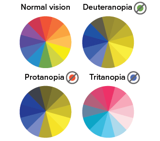
Color blindness affects approximately 1 in 12 men and 1 in 200 women globally, summing up to around 300 million people. While often genetic, conditions such as diabetes, multiple sclerosis, or aging can also contribute to its occurrence. Our project zeroes in on the four most prevalent types of colorblindness: Protanopia (red-green), Deuteranopia (green deficiency), Tritanopia (blue-yellow), and Monochromatism (absence of color perception). It’s important to acknowledge that our understanding of colorblindness is largely based on research conducted in Western populations, and variations may exist globally.
Our experience in the data visualization course has underscored the critical role of color in various domains, ranging from art and aesthetics to education and scientific research. This insight inspired our project’s theme and three primary objectives:
- Educate users about the different types of color blindness.
- Provide an immersive experience allowing users to view the world through the lens of someone with color blindness.
- Offer a test feature to help users identify if they might be affected by one of the four main types of color blindness.
The Math: Explained
Mathematical Foundation of the App: Although not the first feature encountered in our app, the math section forms the core of all the filters used throughout. Our aim was to demystify the complex linear algebra behind the color blindness filters, breaking it down into three straightforward steps: transforming RGB to LMS (long, medium, and short wave light), applying the LMS filter, and then converting back from LMS to RGB. To enhance user comprehension, we juxtaposed a clear written explanation of these steps on the left with the corresponding matrix mathematics displayed on the right. Maintaining a clean and simple layout was a crucial aspect of our design philosophy.
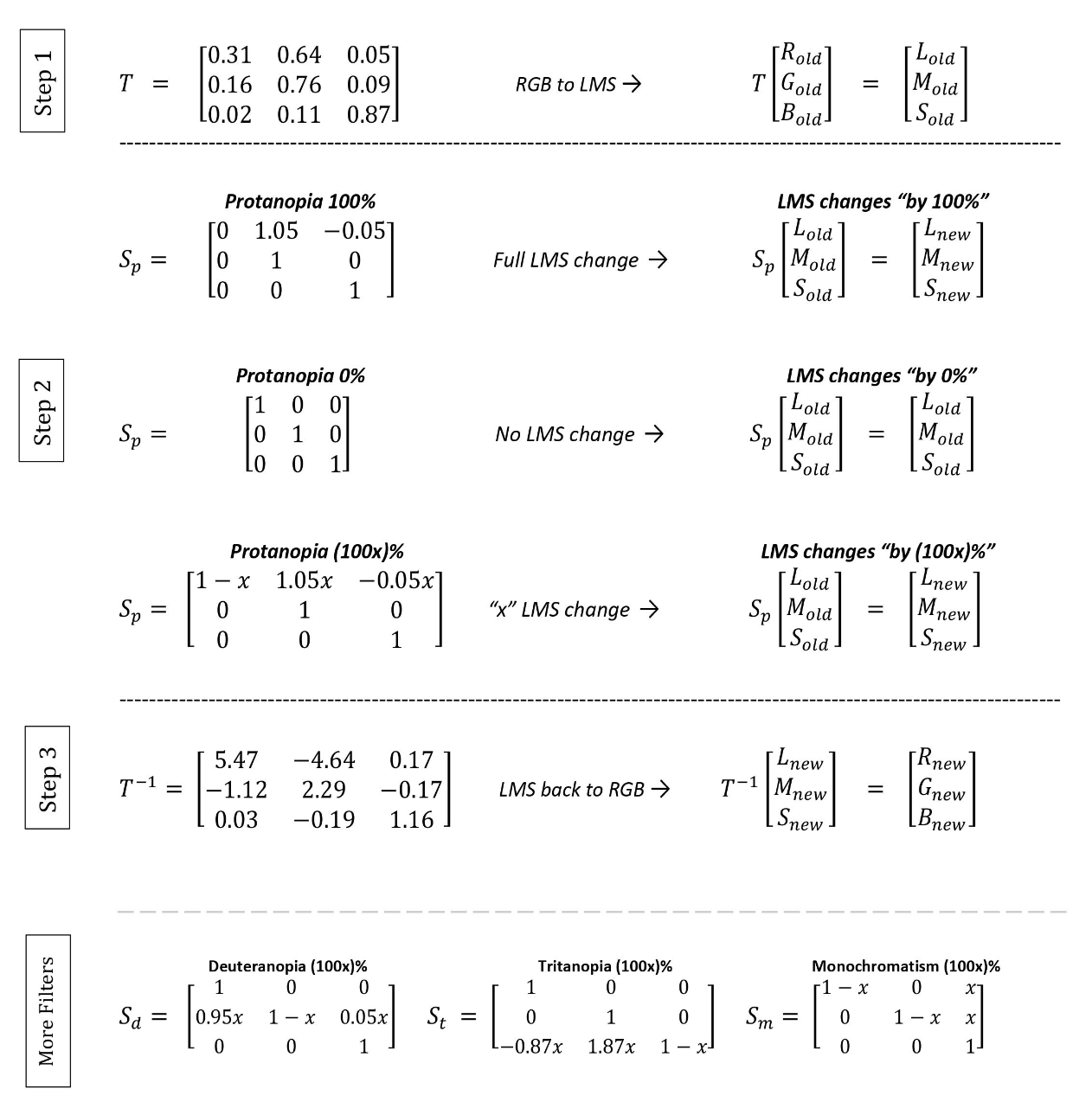
Understanding Colorblind Physiology Through Math: While the mathematics provides the technical foundation, we also wanted to ensure that users gain an insightful understanding of the physiology underlying color blindness. This aspect was seamlessly integrated, as comprehending the differences between long, medium, and short cones in relation to RGB space is essential to grasping the mathematical framework. Additionally, the physiology of color blindness is further explored in relation to how different cones perceive light, offering users a more profound appreciation of the causes behind various types of color blindness.
Quantifying Colorblindness Severity: A unique feature of our app is the ability to define and visualize varying degrees of color blindness. This concept, while not conventionally used in medical diagnostics, was essential for the functionality of our app, particularly for the sliding scale feature in the colorblind filter section. By creating a continuous variable to represent the severity of color blindness, we enabled users to adjust the filter and experience different levels of color perception challenges. This innovative approach provides a practical tool for understanding the spectrum of color vision deficiencies.
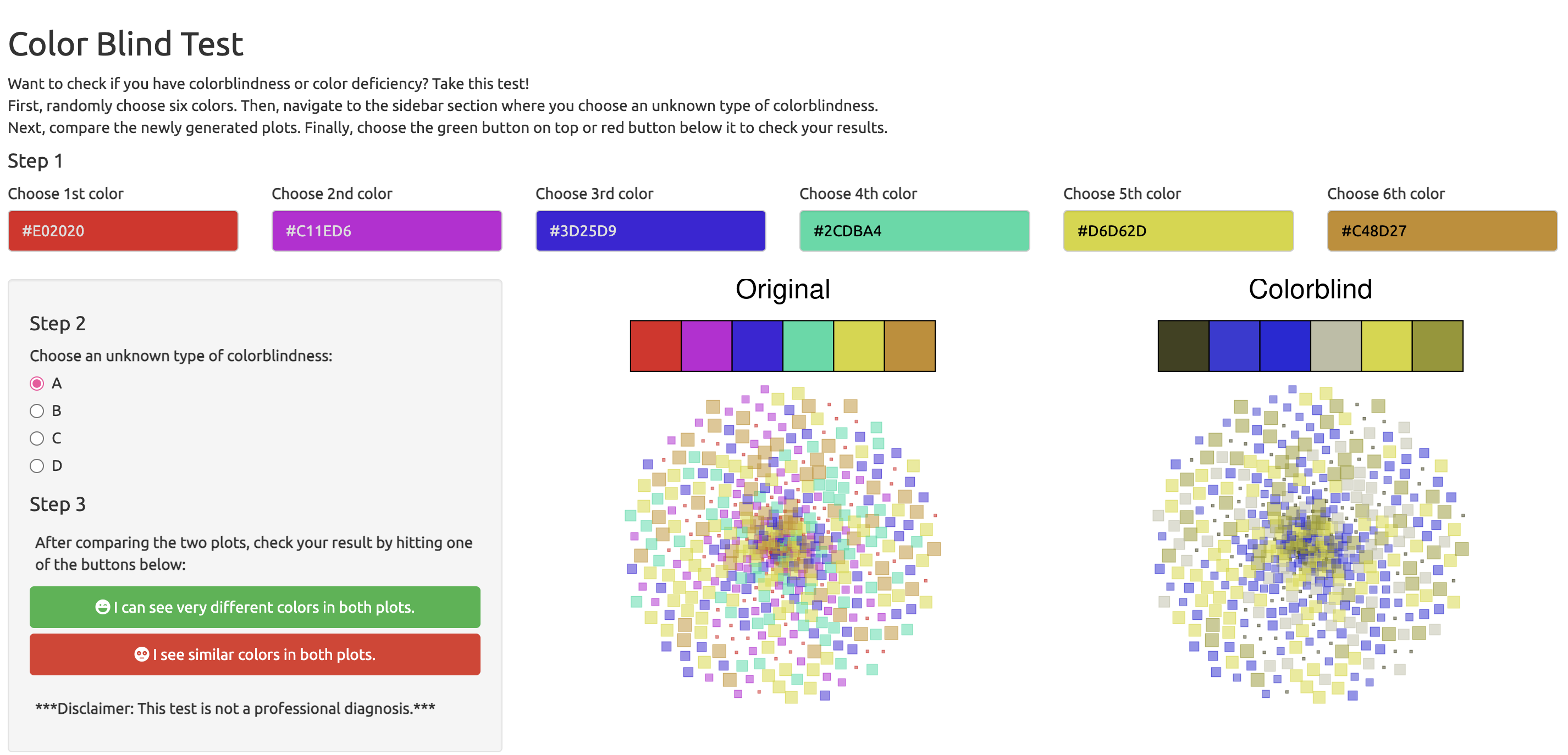
Feature 1: Color Blindness Test
The “Are You Color Blind” tab is an integral feature of our app, offering users an interactive experience to understand different types of color blindness. It’s important to clarify that this test is a simplified tool meant for awareness and education, not a professional medical diagnosis. Its primary purpose is to serve as an indicator of potential color vision deficiencies.
Our design approach for the test is innovative and user-centric. Unlike the traditional Ishihara test, which uses fixed patterns and colors, our test allows users to actively participate by selecting colors and types of color blindness. The test generates two plots: an original plot with the user-selected colors and a colorblind plot, where these colors are adjusted using our predefined color blindness filters. This unique design uses generative art to maintain visual consistency while introducing randomness in color and color blindness choices. The two plots are accompanied by mutated stacked bar charts that visually represent the user’s color selections. To avoid biasing the user’s perception, the colorblind plot is simply labeled “Colorblind” rather than specifying a particular type of color blindness.
Upon viewing these plots, users are asked to assess the color differences and respond by selecting either a green button (indicating “very different colors”) or a red button (“similar colors”). This feedback triggers a result message that provides information about the represented type of color blindness and general advice. Our careful choice of language in the response options aims to prevent overdiagnosis and undue concern about color blindness.
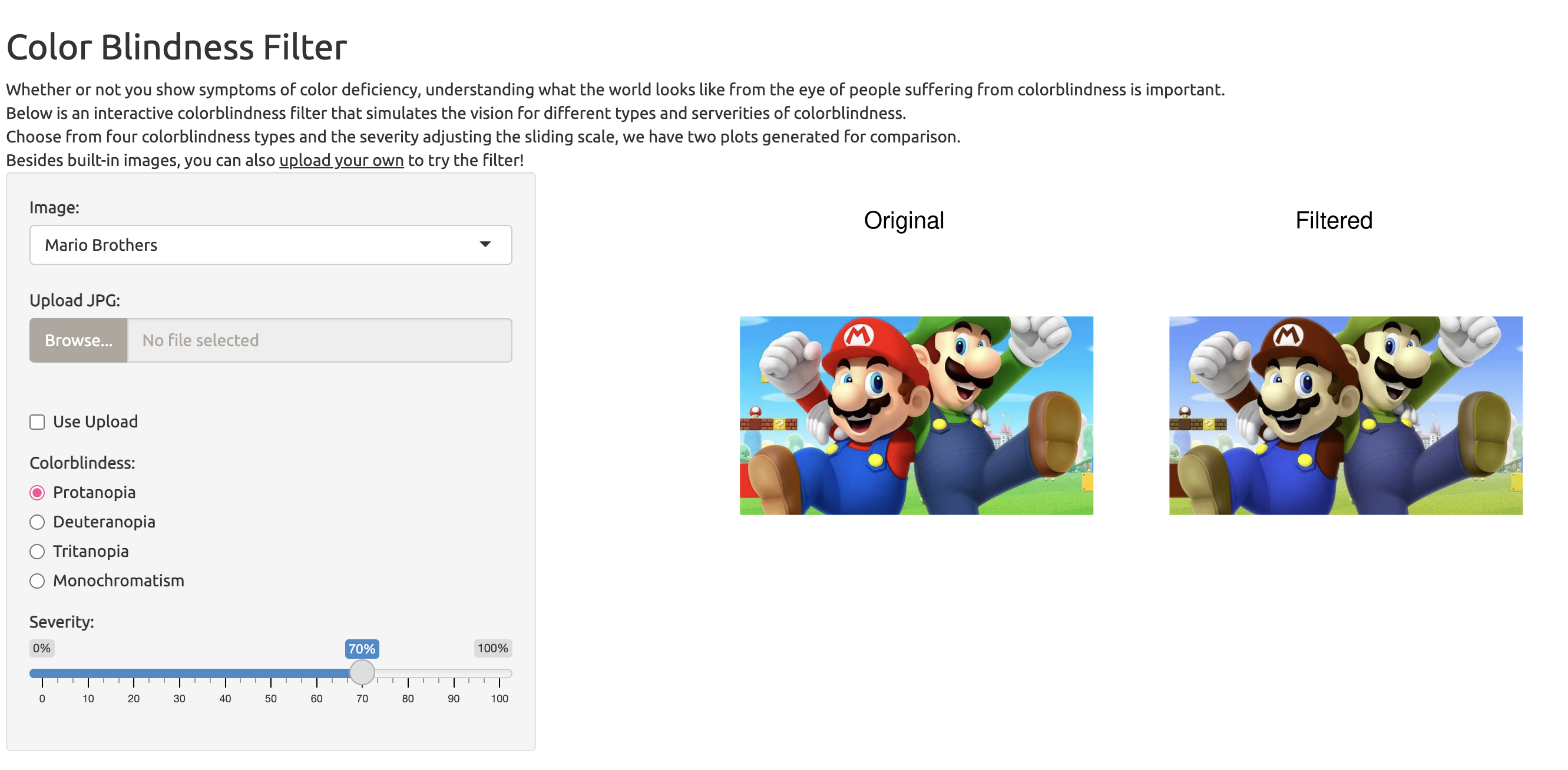
Feature 2: Color Blindness Filter
The “Color Blindness Filter,” positioned as the third tab in our interactive web application, offers users a unique window into the experiences of colorblind individuals. This feature is designed to simulate the perception of the world as seen by someone with various types of color blindness, at different levels of severity. To facilitate this, we provide a selection of built-in images that showcase a broad spectrum of colors. Additionally, users have the option to upload their own images for a more personalized experience.
The core functionality of the filter lies in its ability to process the input image—whether one of our built-in selections or a user-uploaded photo—and modify its RGB values through matrix transformations. Each type of color blindness — Protanopia, Deuteranopia, Tritanopia, and Monochromatism — requires a unique transformation to simulate its visual effect accurately. A key feature of our filter is the sliding scale that adjusts the severity of color blindness. This interactivity allows users to visualize milder forms of color blindness, such as Protanomaly for Protanopia, Deuteranomaly for Deuteranopia, and Tritanomaly for Tritanopia. Monochromatism, often considered the most severe form of color blindness, is also represented in our model.
Through this interactive filter, users can gain a deeper understanding of what it means to live with color blindness, experiencing firsthand the varying degrees of this condition. The feature not only serves as an educational tool but also fosters empathy by providing a vivid illustration of the challenges faced by those with color vision deficiencies.
Impact and Audience Engagement
Our web application, “Exploring Color Blindness,” is primarily aimed at individuals seeking a deeper understanding of color blindness, those interested in self-testing for color vision deficiencies, and creators who aspire to make their visual content more accessible. The overarching goal of our site is to inspire a reflective consideration of the colors we encounter daily and often take for granted. We aim to cultivate an awareness that extends beyond mere knowledge acquisition, motivating users to integrate accessibility considerations into their routine activities.
One of our core aspirations is that users, after engaging with our app, will be more inclined to employ colorblind-friendly palettes in their data visualizations, whether in academic settings or professional environments. The significance of keeping colorblind individuals in mind while crafting meaningful visualizations cannot be overstated. This is particularly relevant at Duke University and, more specifically, within the Statistics Department, where students frequently engage in data visualization projects. Our app underscores the importance of utilizing accessibility-focused tools and color schemes, such as scale_viridis(), to ensure that visualizations are comprehensible and appreciated by viewers with color vision deficiencies.
As a practical example, our waffle chart featured on the first tab of the website incorporates colors from Paul Tol’s Colorblind Safe Colour Schemes, which are purposefully designed for enhanced accessibility. This implementation serves as a model for others, encouraging the adoption of similar practices in their work. By setting this precedent, we hope to foster a culture of inclusivity both within the Duke community and beyond, paving the way towards a more considerate and accommodating society where visual content is accessible to all.